Guide to Writing Alt Text for Academic Book Illustrations
Thoughtfully written alt text is essential to making your academic book or article more accessible to visually impaired audiences.

If you’ve recently signed an academic book contract, chances are your editor has included alt text on your final submission checklist. But whether or not you’re already familiar with alt text (short for alternative text), how prepared are you to write it?
The rising demand for and availability of e-books and other electronic publications has greatly increased the accessibility of scholarship, not only because of the convenience the internet affords us in accessing information quickly, but also in facilitating how information may be transmitted and communicated. For those who are visually impaired, screen readers offer a practical form of assistive technology that transforms text into audio; alt text provides a meaningful way for screen readers to communicate visual information that would otherwise be inaccessible.
Especially for scholarship that relies heavily on the use of visual materials, providing thoughtful and efficient alt text for figures can make or break how visually impaired readers will interact with and digest your arguments. And yet, alt text is very often an afterthought: something that writers must tick off their list as they prepare their final manuscript files for academic publishing.
Recently, I found myself in the tricky position of having to come up useful alt text for nearly 70 images while also confirming image permissions, finalizing manuscript edits, and putting together an index for my own book, and I’ve been thinking a lot about how useful it would have been to have made alt text part of my writing process and what strategies I should employ in making my figures relevant to all readers. Below, I offer a few thoughts on how to approach alt text and provide some advice for effectively writing alt text for scholarly publications.
What Is Alt Text and When to Think About It
Alt text is written copy that “lives” inside of a digital image file. It appears in place of the image if it fails to load in a digital space and is used by screen readers to describe the image to visually impaired people.
Whether you’re working on a book manuscript or an academic journal article, writing alt text is a good habit to get into. Although not all journals require authors to provide alt text, I imagine digital publications across the board will soon adopt accessibility standards that include alternative image text.
Most importantly, however, accessibility for a diverse readership should never be an afterthought, so if visual material is central to your work, alt text should be generated as you write. In fact, writing alt text as you go can not only make the final stages of publishing more efficient, but can also yield more effective alt text.
When thinking about image accessibility, it is important to remember that alt text is not a caption. Captions communicate facts about the image—artist, title, date, etc.—but alt text needs to convey meaning. An image’s caption is relatively stable; formatting may vary across different works in which the image appears, but the information itself is virtually unchanged.
An image’s alt text, conversely, can vary across different publications because the purpose of that image differs within the context of a specific text. When you write alt text as you go, that context is foremost and can therefore be valuably inscribed into the image description.
Writing Effective Alt Text
As including alt text has become an increasing standard accessibility practice across the web, countless guides to best practices have become available both on and offline. University presses and other academic publishers are also likely to have their own style guides and preferences—not unlike those they provide for citations and captions—that authors are expected to adhere to.
That said—like citations and captions, which we often write in advance and then adjust to publishers’ preferred style—there are a few key components of constructing alt text that we should keep in mind while preparing academic texts for publication.
- Be concise. The goal of alt text is to make images more accessible, that is, to facilitate understanding without creating more work for visually impaired readers than for other readers. While publishers may vary on the maximum word count you are afforded per image, a general rule of thumb is to keep it under 40 words (you can always cut or add to suit your publisher later).
- Avoid repetition. Remember that those using screen readers will also have access to the caption, so there is no need to repeat names, dates, locations, or other information about the image that appears alongside the image. Instead, consider which visual details are provided in the caption and which additional details the reader needs to understand why that image has been included.
- Think contextually. Rather than being purely objective, describe gestures, expressions, moods, and specific objects that complement the points being made in your main text. Even if the image you are describing is a seemingly objective chart or data visualization, draw attention to outliers and patterns that underscore your arguments.
- Write illustratively. As artists Shannon Finnegan and Bojana Coklyat of Alt Text as Poetry argue, alt text users should not just have access to visual material online, but should “feel a sense of belonging in digital spaces.” Rather than just complying with accessibility requirements when composing alt text, consider the reasons we use images in the first place and strive to recreate the experience of the image.
Some Examples of Alt Text
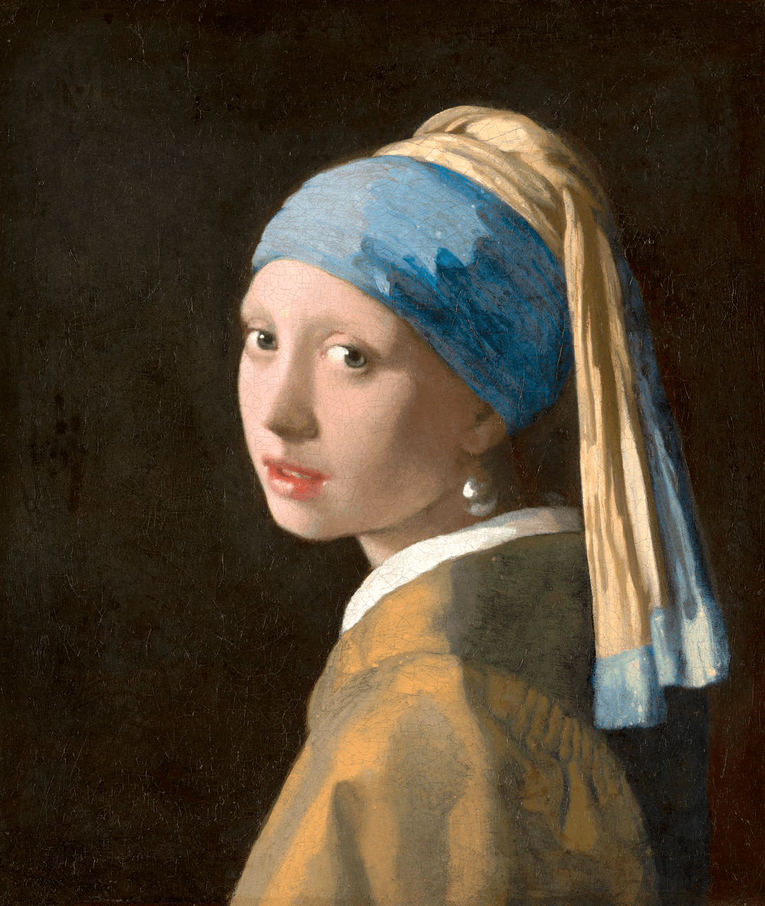
Caption:
Johannes Vermeer, Girl with a Pearl Earring, 1665. Oil on canvas, 44.5 × 39 cm. Collection of the Mauritshaus, The Hague.
Alt text:
A young woman tilts her head over her shoulder, gazing tenderly toward the viewer with her lips gently parted. A turban covers her hair, leaving only the bottom half of her ear, adorned with a large, glimmering pearl, exposed.
Caption:
Marcel Duchamp, Nude Descending a Staircase No. 2, 1912. Oil on canvas, 147 × 89.2 cm. Collection of the Philadelphia Museum of Art, Philadelphia.
Alt text:
A jumble of rigid sketchy shapes and lines cascade diagonally from the upper left to the lower right, suggesting a female figure in motion. Wispy, curved lines where the figure’s legs are understood to be, indicate a rapid, downward moveme
Get a rate quote or schedule a consultation call by clicking below.