Flatpage Announces Rebrand and Expansion
Our new, dynamic design demonstrates Flatpage’s commitment to a diversity of ideas.

Launched in 2021, Flatpage is the brainchild of cofounders David Hariri and Cara Jordan. As an idea-driven editorial agency and publishing house with roots in academia, technology, and the visual arts, our mission is to empower authors through accessible writing. Our name reflects the finished product of our collaborations with writers: completed work, published and opened on a flat page, ready to connect with readers.
This summer, Flatpage is pleased to announce its new brand identity, conceived by My dear Studio, and executed for the web by Atonal: a vibrant, elegant design that represents our unique ability in assisting writers with getting their ideas onto the page and out into the world. This new look also coincides with the growth of our in-house team and publishing program, further enhancing the services we’re able to offer our editorial clients and potential authors.
Design Concept
Berlin- and Barcelona-based design firm My dear Studio, worked with Flatpage to conceptualize the rebrand starting in fall 2023. With an effervescent approach to design, the team at My dear aligned with our work in helping creative, corporate, and academic clients find a wide readership for their writing.
The logo
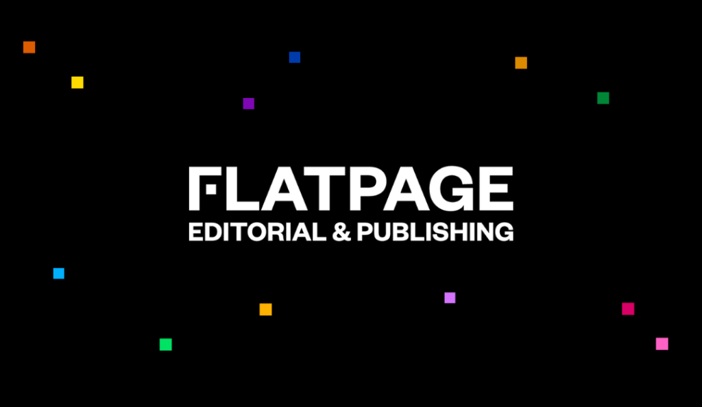
The new word- and lettermark logos play on the idea of a page with script. The body of the letter F forms the corner of a page, and the horizontal stroke is replaced by a small, cubic “fundamental dot,” the basic unit of our new identity that represents the starting point for our authors. The dot represents an idea that is intended to be spread to a wider audience, starting with the words on the page.
The logo can be used in multiple formats: the wordmark is the primary identifier, which contains the F icon as a lettermark. The wordmark is used most often to represent our brand, especially to an unfamiliar audience, whereas the lettermark was designed for use in smaller spaces, such as on the web, social media, and book spines.
Additionally, the logo can be combined with the tagline “Editorial & Publishing,” the two distinct parts of our business as an editorial agency and publishing house.
The identity
Elegant and minimalist, the new design identity reflects the clients that Flatpage works with: design-forward and intellectual. Here, My Dear Studio, expanded on the concept of the fundamental dot used in the logo, playing on the concept of our authors’ ideas taking different colors and disseminating across space. That larger space represents the potential of what editors can do and what our clients can publish.
Set on either a black or a white background, the colorful dots play across the field, showing the range of ideas authors can have and the types of audiences they can engage. The core palette consists of a primary grayscale and an extended palette consists of six Pantone colors and their corresponding darker values, which can be combined in multiple different ways.
The designers chose Silva Display, a serif typeface designed by Blackletra, for the primary typeface and Open Sans, an open source humanist sans-serif typeface, for the secondary typeface.
New Website
For the primary application of the new branding, Flatpage engaged Brazil-based Atonal to develop and implement a new website. Run by a team of talented web designers, animators, project managers, and developers, Atonal had partnered with My dear Studio, on a number of projects prior to Flatpage and was the perfect choice to deliver a high-quality website for our audience.
Working closely with Atonal, Cara and David planned a paired-down website that would offer improved functionality and user experience through more targeted design modules and minimalist pages. Further, Atonal used the new branding strategy by implementing the new color palette, typography, and the concept of the fundamental dot throughout the pages.
The new website has a more logical flow and will appeal to a design-focused audience while remaining approachable for all potential collaborators.
Team
In addition to our rebranding, the past few months have also marked a period of growth for the Flatpage team: we now have several new employees who are available to serve our clients, in addition to our pool of dedicated freelance editors.
Our editorial team has expanded to include Jen Liston, copyediting and proofreading team lead, and James Cui, line editing team lead. In their new roles, these passionate editors will be managing projects and performing quality control in their respective editing fields.
We also hired Mary Sasso as our marketing manager. Mary will be responsible for running our advertising and promotional activities, including assisting the authors who publish with us to promote their books. She’ll also manage our social media accounts, write blog posts, and perform outreach to potential clients.
Publishing
Alongside our new identity and website, Flatpage is also extending the reach of our publishing efforts. Beginning with our first book, The Art of Academic Editing, which was published in January 2024, Flatpage seeks to publish books written by researchers—primarily academic authors and journalists—who want to access broader audiences through their writings.
Our publishing page now includes another call for proposals: we are currently seeking proposals for books that explore topics related to the editorial and writing process geared toward editorial professionals and/or nonfiction writers in academia, the arts, and businesses.
Potential topics might relate to Flatpage’s six editorial service categories (coaching, developmental editing, line editing, copyediting, proofreading, or indexing), or the nonfiction writing and publishing process.
For more information about how to submit a proposal, please visit our publishing page.
Get a rate quote or schedule a consultation call by clicking below.